In some situations, when a user invokes an action in your app, it's a good idea to confirm oracknowledge that action through text.
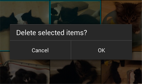
Confirming is asking the user to verify that they truly want to proceed with an action they just invoked. In some cases, the confirmation is presented along with a warning or critical information related to the action that they need to consider.
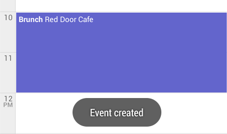
Acknowledging is displaying text to let the user know that the action they just invoked has been completed. This removes uncertainty about implicit operations that the system is taking. In some cases, the acknowledgment is presented along with an option to undo the action.
Communicating to users in these ways can help alleviate uncertainty about things that have happened or will happen. Confirming or acknowledging can also prevent users from making mistakes they might regret.
When to Confirm or Acknowledge User Actions
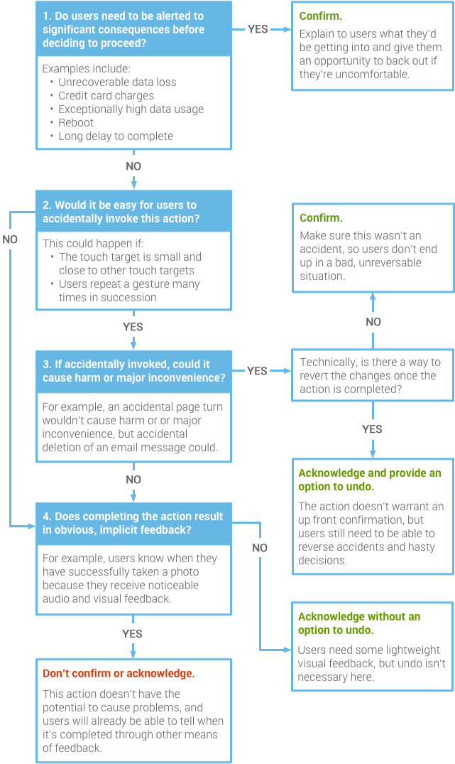
Not all actions warrant a confirmation or an acknowledgment. Use this flowchart to guide your design decisions.
Confirming
Example: Google Play Books
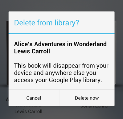
In this example, the user has requested to delete a book from their Google Play library. An alert appears to confirm this action because it's important to understand that the book will no longer be available from any device.
When crafting a confirmation dialog, make the title meaningful by echoing the requested action.
Example: Android Beam
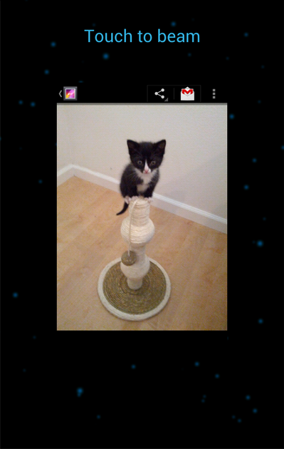
Confirmations don't necessarily have to be presented in an alert with two buttons. After initiating Android Beam, the user is prompted to touch the content to be shared (in this example, it's a photo). If they decide not to proceed, they simply move their phone away.
Acknowledging
Example: Abandoned Gmail draft saved
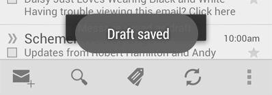
In this example, if the user navigates back or up from the Gmail compose screen, something possibly unexpected happens: the current draft is automatically saved. An acknowledgment in the form of a toast makes that apparent. It fades after a few seconds.
Undo isn't appropriate here because saving was initiated by the app, not the user. And it's quick and easy to resume composing the message by navigating to the list of drafts.
Example: Gmail conversation deleted
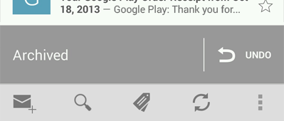
After the user deletes a conversation from the list in Gmail, an acknowledgment appears with an undo option. The acknowledgment remains until the user takes an unrelated action, such as scrolling the list.
No Confirmation or Acknowledgment
Example: +1'ing

Confirmation is unnecessary. If the user +1'd by accident, it's not a big deal. They can just touch the button again to undo the action.
Acknowledgment is unnecessary. The user will see the +1 button bounce and turn red. That's a very clear signal.
Example: Removing an app from the Home Screen

Confirmation is unnecessary. This is a deliberate action: the user must drag and drop an item onto a relatively large and isolated target. Therefore, accidents are highly unlikely. But if the user regrets the decision, it only takes a few seconds to bring it back again.
Acknowledgment is unnecessary. The user will know the app is gone from the Home Screen because they made it disappear by dragging it away.


No comments:
Post a Comment